Three Flowers For You
2026-May-19, Tuesday 18:53We visited a botanical garden today. Please enjoy these botanicals. You can click on the images to expand them.


In order: Foxglove, Lotus, Coconut Orchid.
T’was a lovely day.
— JS
We visited a botanical garden today. Please enjoy these botanicals. You can click on the images to expand them.
In order: Foxglove, Lotus, Coconut Orchid.
T’was a lovely day.
— JS
(This blog essay is overdue because I'm still waiting for new prescription glasses and writing while cross-eyed with text zoomed to 250% is tedious. They should be here later this week. Meanwhile ...)
Back in January 2022 I wrote an essay revisiting my predictions for 2017. My review of 2017's stab in the dark began, "it spanned three blog posts and ended happily in a nuclear barbecue to put us all out of our misery: start here, continue with this, and finale: and the Rabid Nazi Raccoons shall inherit the Earth."
I'll actually stand by those 2017 predictions, which were weirdly not that far off the mark although Queen Elizabeth II outlasted my prediction by several years.
But my 2022 predictions?
Oh boy.
Look, for an amateur futurologist writing in January of 2022 it was arguably forgivable to miss the US electorate being so boneheadedly stupid that they'd re-elect the most corrupt president in their nation's history, at the head of a Gish gallop of barkingly ignorant and destructive cranks and conspiracy theorists determined to tear down the republic and destroy its vital institutions, all in the name of returning the social order (per the Project 2025 plan) to the 50s--the 1850s, that is, not the 1950s. With 20/20 hindsight, what I missed was the now-obvious wave of media ownership consolidation, including corporate social media such as X, Meta, and Google, in the hands of a narrow class of billionaire oligarchs. I also missed the complacent incompetence of the Biden administration with respect to organizing their succession plans--it was obvious that by 2024 he'd be vulnerable to campaign ratfucking on grounds of his age, and his anointed successor was guilty of being (a) too female and (b) non-white, rendering her unacceptable to a large chunk of the voters.
But, even if you forgive my failure to recognize the catastrophic collapse of the US as a credible hegemonic superpower over the past 3-4 years, I can only hang my head in shame over my failure to anticipate the Ukraine war, which broke out six weeks after that blog essay. Let alone to anticipate a revolution in military affairs as profound as that brought about of the first world war.
Similiarly, I have no excuse for not recognizing that an Israel with politics dominated by Benjamin Netanyahu would go Full Nazi sooner rather than later, as the genocide in Gaza and the program to build a Greater Israel in Lebanon demonstrate. I mean, I grew up going to synagogue and have visited Israel more than once! I should have seen the signs, they were all there as far back as the 1980s. Mea culpa. (And fuck those guys.)
While I correctly recognized the EV transport revolution, I missed the concurrent solar power and grid-scale battery revolution, now very visibly in train and arguably more important than the arrival of cheap electric cars and cheaper e-bikes. I didn't notice the global supply chain crisis of 2021-2023, even then gathering pace, although it didn't impact consumer prices for a few more months.
Possibly my worst miss is that I completely discounted the profound social impact of LLMs (or so-called "AI"), not simply as a massive technology sector investment bubble and happy hunting ground for snake oil salesmen and grifters, but as a corrosive influence on population-level critical thinking. I should have seen it coming--I read Joseph Weizenbaum's Computer Power and Human Reason back in the 1980s--but I didn't recognize just how unable to see past the ELIZA illusion most people would prove to be.
Nor did I expect the transhumanists, extropians, and the rest of the hairball of beliefs now congealing into the syncretistic techno-religion of TESCREAL to have seized control of trillions of dollars of private equity and not only be arguing about the Singularity but to be squabbling over who gets to run it (with a side-order of racism and eugenics on top, because every flavour of crank batshittery is so much better with a side-order of fascism and concentration camps).
So I'm sticking a flag in the ground here and admitting: I am officially a shit futurologist.
Back in 2022, and before that, in 2017 and even in 2007, I espoused a general rule of thumb about predicting the future, that:
Looking 10 years ahead, about 70% of the people, buildings, cars, and culture is already here today. Another 20-25% is not present yet but is predictable -- buildings under construction, software and hardware and drugs in development, children today who will be adults in a decade. And finally, there's about a 5-10% element that comes from the "who ordered that" dimension
2022 forced me to update the ratio to:
20% of 10-year-hence developments utterly unpredictable, leaving us with 55-60% in the "here today" and 20-25% in the "not here yet, but clearly on the horizon" baskets
Anyway, it's now 2026, and I officially give up.
The Stross Ratio for predicting events ten years hence is now 60/10/30. That is: 60% of the people, buildings, and culture are here today. 10% is predictably on the drawing boards, and a whopping 30% is utterly unpredictable.
Airborne Hantavirus pandemic or global Measles pandemic, who the fuck knows what we're going to get--given that the US FDA is run by a crank who doesn't believe in the germ theory of disease and seems to be trying to spike vaccine development globally?
A shutdown of global semiconductor fabrication caused by a worldwide helium shortage, and a global fertilizer shortage causing famine and food price spikes, due to a senile sundowning autocrat starting a war with Iran without any clear exit strategy?
Who ordered any of this?
I'm reasonably confident that the Russian invasion of Ukraine will be over by this time in 2030--quite likely by this time in 2027, due to the collapse of the Russian domestic economy. I'm also reasonably confident that the US war on Iran will be over by this time in 2030, if only because Trump will most likely be dead or in palliative care (possibly following his removal in a soft coup via Article 25 of the US constitution, due to his very obvious current illness and decline). (Note that Trump's insistence on "running for a third term" is very probably a serious sign that the electoral process in the USA is no longer fully functional, under the aegis of the supreme court he appointed, as long as he survives. His successor may not be able to sustain his ability to ignore the law: if they can, then, well, the US Republic is over: it had a good run, from 1776 to 2026.) The AI bubble will have burst long before May 2027--the semiconductor pinch caused by the aforementioned helium supply crisis will cripple Nvidia's ability to manufacture chipsets for data centers, and the US DCs are all being built to run on diesel/kerosene burning gas turbine power plants anyway, the price of which has skyrocketed due to the gulf war.
I expect us to be well into Great Depression 2.0 by this time in 2030.
There will be some grounds for hope. The global energy transition to renewables will, by that point, be a done deal. It also means China will have replaced the USA as the global energy superpower--not because they dominate the transport routes for energy but because they manufacture 80% of the planet's EVs and PV panels and batteries. But that's a tenuous hold on superpowerdom. If the Chinese government throws its weight around in the 21st century the way the USA did in the 20th, it will rapidly find first-tier rivals building up their own manufacturing capability: meanwhile, PV/battery is inherently easier to distribute that large, centralized grid based power supplies, and the dronification of warfare means (at least in the near term) that rapid mechanized wars of maneuver are a non-starter: the "fog of war" is on the way out, replaced by highly precise targeting of advancing assets and the robotization of the front line.
In space, I'm pretty sure we will see a Kessler Syndrome event if the idiotic rush towards putting data centers in orbit goes anywhere. But I think it's not going to happen--SpaceX is inextricably tied to the current tech bubble, and when it pops Elon Musk is going to wish he had a bunker to hide in.
The main casualty of this decade is the ideological credibility of capitalism as a social organizational principle.
Enshittification, also known as platform decay, per wiki, is "a process in which two-sided online products and services decline in quality over time. Initially, vendors create high-quality offerings to attract users, then they degrade those offerings to better serve business customers, and finally degrade their services to both users and business customers to maximize short-term profits for shareholders." Systematic capture of the US government and the global system of trade by capitalists has resulted in the creation of a framework optimized for enshittification all round, and the result is the enshittification of everything--all the infrastructure of the capitalist world is decaying and on fire as the post-privatization owners loot it.
This is the Marx-predicted crisis of capitalism, and it's been in progress since the collapse of the USSR in 1991 removed the main ideological standard-bearer for opposition. It accelerated in 2008 with the global financial crisis, and again in 2020 when the pandemic provided top cover for the hyaenas to go on a looting spree. They've stripped the corpse of actually-existing social democracies everywhere to the bone, and now they're cannibalizing their own body politic. Disaster capitalism has finally come home to roost, and it won't end until the global financial system collapses. Meanwhile, the generation born in the 21st century has no time for their shit. We are moving into a political state weirdly reminiscent of the period between 1905 and the 1930s. If we're lucky we're going to get New Deal 2.0 and a brisk round of socialism: if we're unlucky, it's going to be guillotine time all over again.
PS: do not expect to see me visiting the USA any time soon. Millions of people applying for a US visa are now required to make all of their social media accounts publicly visible -- or risk having their applications delayed or denied outright. The directive, which covers more than a dozen nonimmigrant visa categories, has been rolling out in phases since June 2025 and expanded significantly as of 30 March 2026. This policy is impossible to implement without feeding all those social media profiles to an LLM in search of a verdict, and they'll obviously be screening applicants for ideological compatibility. And if it's rolling out to visa applicants now, the automated program will inevitably be applied to I-94W (visa waiver) travelers shortly thereafter. My social media profile is that of a pro-LGBT pro-Green hard left troublemaker, so ... nope, not going there: I am absolutely not interested in touring the concentration camps of El Salvador!
Mostly I leave Sunday photography to our colleague, the estimable Chris Bertram. Still, this Sunday I was walking the dog in the hills above my town. (“My town” being a modest community of a couple of thousand people in the rolling countryside of northern Bavaria.)
[copyright me, yesterday]
And by the side of a grassy meadow, I stopped to photograph this pretty little yellow flower:

[they look so innocent]
A moment with the app revealed that this was Ranuncula bulbus, the Bulbous Buttercup. There are a bunch of species in the genus Ranuncula, which is another way of saying there are a lot of different kinds of buttercup. That’s because buttercups appear to be a recent evolutionary radiation, and a pretty successful one.
But when I did a quick search on these little guys? I found they used to have another name. The Bulbous Buttercup was once known as Saint Anthony’s Turnip.
Saint… what?
Let’s start with the “Bulbous” part. The Bulbous Buttercup is so called because it has a bulb. Specifically, it has a “corm” — an enlarged stem, just below the surface, that stores energy in the form of starch. 
[pedantry: corms are enlarged stems, while true bulbs like onions are enlarged roots]
The next thing to know is that buttercups are pretty toxic to humans. The leaves and stems, the sap, the flowers, and the corm — all bad. Eating one buttercup won’t kill you, but it could make you sick.(1) And buttercups are a significant menace to horses and cattle, who are also vulnerable to the toxins. Google around and you’ll find lots of online articles about how to kill this pretty-but-dangerous little flower if it shows up in your pasture. So while that crunchy little corm has lots of calories — starch and a bit of protein — it’s not going into any salads.
(1) The lethal dose for humans seems to be about 500g, or about a pound of fresh buttercup greens. So you’d have to work at it, fair enough.
However: while humans, horses and cows are vulnerable to the buttercup toxin? Swine are not. Pigs will cheerfully eat a buttercup and ask for seconds. In fact, since the corms grow close to the surface, it’s very easy for swine to root them up. A meadow full of buttercups? For a pig, that’s a tasty, nutrient-rich buffet.
So how does that connect to “Saint Anthony’s Turnip”? Well, that’s easy: it’s because St. Anthony is the patron saint of swineherds.
[Saint Anthony accompanied by a pig, 15th century]
Which… okay, there are a lot of Catholic saints, and most of them are patron saints of something or other. Pretty much every profession has a patron saint, from funeral directors (St. Joseph of Arimathea) to bartenders (St. Armand of Maastricht). (2) “Swineherd” is one of those jobs that basically no longer exists but that was really quite important for thousands of years. So it makes perfect sense that there would be a patron saint of swineherds.
(2) Some professions have multiple patron saints. Lawyers, for instance, have three or four. Catholic lawyers know the Lawyer’s Prayer to St. Thomas More, which gives good advice even if you’re neither a lawyer nor Catholic.
But wait a moment. Is this… the Saint Anthony? Saint Anthony the Great? The third-century Roman who gave up all his wealth and went out into the Egyptian desert to become a hermit, where he was alternately tormented and tempted by demons? That Saint Anthony?
[copyright Michelangelo Buonarotti, c. 1487)
Yup, that’s the guy.
So the original story of St. Anthony comes from a Roman bishop named Athanasius, who wrote a Life of Anthony sometime in the late fourth century. I went back to look at that original text (pdf). And while the Life has both the temptations and the torments, there’s nothing about pigs.
But somewhere, somehow over the centuries a bunch of legends and traditions accreted around St. Anthony. So, there’s a legend that a demon possessed a wild pig in order to threaten the saint, and then Anthony cast out the demon, and the grateful pig became his friend and companion. In another story, Anthony healed the piglet of a wild sow, which caused the sow to follow him around like a pet. There are a number of these.
Which is all perfectly common and normal for saints, especially early / OG saints. (3) But as to why pigs particularly… nobody seems to know.
[but there it is]
(3) St. Anthony is also associated with fire — see him standing in flames in the middle image above? There are like three different legends associated with that and I’m not even going there.
So if you have a nodding acquaintance with European art history, you know there’s a vibrant tradition of pictures about the Temptations of Saint Anthony, from Hieronymus Bosch —
[as Bosch goes, relatively restrained]
— to Salvador Dali.
[Dali painted this for a contest!]
The subject matter gave artists pretty free rein, after all. They could depict the grotesque, monstrous, surreal or erotic —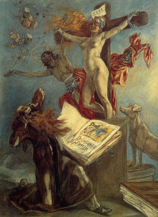
[but note stalwart companion pig]
— sometimes to the extent that the saint himself simply vanishes under a mass of demonic weirdness.
[tbf this is Max Ernst, and… yeah, it’s Max Ernst.]
And of course, the modern internet has joined the fun.
But okay! Somehow St. Anthony became associated with a pig. So you have a tradition of Anthony depicted as tormented and/or tempted, and another tradition showing him with a pig.
[or sometimes both]
And based on the pig connection, Anthony became the patron saint of swineherds. (4) And thus, the pig-edible Bulbous Buttercup became St. Anthony’s Turnip. All done, then?
(4) I went down a whole side-bar rabbit hole on swineherds — everything from the Gadarene Swine to Circe to the dueling shapeshifting swineherds of Irish legend. TLDR, the status of swineherds varied wildly over times and places, but they were associated with various sorts of magic and weirdness way more often than you might think.
Well… there are a couple of other things. In England there was a tradition of taking the smallest pig of a litter — what today we would call the runt — and donating it to the Church. And these little pigs were known as tantony pigs, with “tantony” being a contraction of “Saint Anthony’s”. This in turn led to occasional use of “tantony” as a verb, meaning to follow someone superior like a little pig following its mother. The word is now entirely obsolete, but now and then it still pops up.
The other thing has nothing to do with pigs or saints. If you’re British, Irish or American you might recall a child’s game where a child holds a buttercup under your chin, and if your chin turns yellow, it means you like butter. Nobody has any idea where that comes from, but it’s true that if the sun is shining, and you hold a buttercup under your chin, you can get a surprising yellow-gold glow off the buttercup.
[if you’ve never tried this, check it out, it’s actually pretty cool]
So the reason this happens is because buttercups are very glossy and reflective. Is this just random?
No. According to this paper (“Functional Optics of Glossy Buttercup Flowers”), there are a couple of reasons for it. One is what you’d expect — it’s probably more attractive to potential pollinators. But the other is this:
“Buttercup flowers are heliotropic and when ambient temperatures are low they have approximately the shape of a paraboloid.”
— A heliotropic flower is one that, over the course of a day, turns to face the sun. A paraboloid is the three-dimensional version of a parabola. It has the interesting property that anything striking its inner surface tends to get bounced or reflected directly to a single point in its center. So…
“Under these circumstances, incident sunlight that reaches the petal surface under a large angle will not be reflected to the outside but towards the central flower area where the reproductive structures are located. This will cause increased floral temperatures, which enhances seed and pollen maturation and is preferred by pollinators… Indeed, under natural conditions, the centre of the paraboloid-shaped glossy flowers of the arctic buttercup, R. adoneus, were found to be several degrees warmer than the ambient air.”
In other words, the buttercup is a little solar oven. It focuses sunlight into its center, partly to keep its own genitals warm, but also as a boon to pollinators. On a cool but sunny spring morning, cold-blooded insects will prefer the flowers that literally warm them up, allowing them to bask in concentrated sunlight. 
[like a cozy snuggle in a warm blanket]
So the sun-focusing buttercups will get pollinated preferentially over flowers that don’t have this ability.
If you’re a science fiction nerd, you might remember that an author named Larry Niven once proposed an alien plant called a “sunflower”. It grew a flower with a mirror surface that could reflect and focus sunlight…
A single species of plant evenly dispersed across the land, from here to the infinity-horizon. Each plant had a single blossom, and each blossom turned to follow Louis Wu as he dropped. A tremendous audience, silent and attentive.
He landed and dismounted beside one of the plants. The plant stood a foot high on a knobbly green stalk. Its single blossom was as big as a large man’s face. The back of that blossom was stringy, as if laced with veins or tendons; and the inner surface was a smooth concave mirror. From its center protruded a short stalk ending in a dark green bulb.
All the flowers in sight watched him. He was bathed in the glare. Louis knew they were trying to kill him, and he looked up somewhat uneasily; but the cloud cover held.
“You were right,” he said, speaking into the intercom. “They’re Slaver sunflowers. If the cloud cover hadn’t come up, we’d have been dead the instant we rose over the mountains…”
There was no alien survivor anywhere in the domain of the sunflowers. No smaller plant grew between the stalks. Nothing flew. Nothing burrowed beneath the ashy-looking soil. On the plants themselves there were no blights, fungus growths, disease spots. If disease struck one of their own, the sunflowers would destroy it.
The mirror-blossom was a terrible weapon. Its primary purpose was to focus sunlight on the green photosynthetic node at its center. But it could also focus to destroy a plant-eating animal or insect. The sunflowers burned all enemies. Everything that lives is the enemy of a photosynthesis-using plant; and everything that lived became fertilizer for the sunflowers.
Niven wrote that around 1970. The first papers on buttercup reflectivity appeared in the 1990s, decades later. So, coincidence.
That said… I mentioned at the start that buttercups seem to be a fairly recent and successful evolutionary radiation, with a bunch of related species spread widely across several continents. At a guess, the reflection is probably the reason. Apparently all buttercups do it. And it is, in biological terms, rather novel. (5) So who knows how far the buttercups might take this trend, millions of years from now?
(5) Edit, added one day after the original post: the “paraboloid reflective petals -> miniature solar oven” trick appears to have evolved independently several times, though buttercups seem to go harder than most. I belatedly found this excellent recent survey paper, which gives an overview of the various tricks flowers use to warm themselves up.
Anyway: I snapped a casual photo while walking the dog, and boom — an hour later I was reading about corms, Catholic hagiography, and the physics of paraboloids. We all learned that little Tennyson poem back in school, right?
Flower in the crannied wall,
I pluck you out of the crannies,
I hold you here, root and all, in my hand,
Little flower—but if I could understand
What you are, root and all, and all in all,
I should know what God and man is.
And that’s all.


Fun fact: Ohio is the only US state to have a flag that is not rectangular — ours is a pennant. Also fun fact: I hardly see anyone ever fly an Ohio state flag. They will fly to Ohio State flag, which is to say, the flag of the football team that has a university attached, but not the actual state flag.
So, I got one (two, actually, the size I wanted only shipped as a pair) and have placed upon our new flagpole, on our new front porch railing. I think it looks pretty nice, and I think this picture is probably as stereotypically Ohio as a picture can get: House with a porch, big lawn, dog in the foreground. All it’s missing is an actual buckeye, I suppose.
Ironically, now I will be leaving Ohio for a few days for some personal travel. You may assume I am posting this to remind myself what home looks like, while I am away.
— JS
Because this is a sentiment that is surely timely.
In addition to singing, I’m playing bass on this one. I tried chugging along with the guitar but it sounded just terrible, so the guitars on this one are courtesy of UJAM, and some MIDI programming on my part for the solo.
Also, I wasn’t intentionally trying for a Tom Petty-like drawl, but damn it’s hard to sing a Tom Petty song without one, so here we are. I hope wherever he is in the universe right now, Tom is not rolling his eyes too hard about it.
Enjoy.
— JS
It’s fair to say that Pamela Ribon and I have come up together in the world. Back in the before times, she and I both started blogging when blogs were still called “online journals,” and our first novels came out close to each other. Since then she’s become a force in animation, working on story and screenplays for Moana, Ralph Breaks the Internet and the animated short My Year of Dicks, for which she received an Oscar nomination, which is pretty damn cool, if you ask me. For a quarter of a century now we’ve stayed friends, supported each other, and celebrated our successes.
Pamela went to high school in Texas, which is where she participated in the UIL One Act Play, the largest theatrical competition in the world. Students and their teachers (22,000 of them!) enter a timed theatrical performance judged on acting and tech, watched by an audience of students and parents, three judges, and a 103-page rule book. Pamela turned her filmmaker eye to one year of the competition, following several schools across the state as they fought their way through the ranks— with all the tears and triumphs and, yes, drama, that entails. That’s now become a film, called, sensibly enough, One Act.
The filming of One Act is done, and now comes the post-production phase, where the film is edited, scored and otherwise made ready for festivals and public presentation, in time for the UIL One Act Play’s 100th anniversary. That takes money, and Pamela and her team could use some help with that. This is where we come in: The Scalzi Family Foundation has pledged $5,000 in matching funds to encourage folks to make a (tax deductible!) donation to help One Act get over its own finish line in post-production. Any amount you donate will be matched by the SFF, up to that $5k (although hopefully they will bring in more than that).
We’re supporting One Act not just because Pamela is a filmmaker worth supporting, but because we think this could be an important film. It brings a spotlight to a part of Texas life that isn’t well-known outside of its borders, and shows a part of the life of the state that can be surprising, and challenging, to outsiders. The UIL One Act competition inspires young creative folks, and changes lives, and that’s a story that’s worth telling, and making a really cool film about.
If this sounds like a film that you would like to help support getting into theaters, here’s the link to One Act’s site, which includes information on how to donate. Again, in the US, these are tax-deductible donations, so that’s pretty nifty. Every donation for the first $5k is matched by the Scalzi Family Foundation, so please feel free to spend our money with yours. We want you to, in fact.
(Also, if you feel like being a big-time donor, like in the five-figure range and above, which comes with its own tier of recognition, there’s contact information on the linked page where you can inquire about that. Go on, do it! You know you want to!)
I’m super proud of Pamela for making this film, and for everything she’s done, and happy the Scalzi Family Foundation can help to get this film that much closer to release. I hope you’ll be inspired to come along for this journey as well.
And if you are: Thank you.
— JS
 That’s right y’all, you’re getting another flower picture! I know, I can hardly believe it myself, but spring is just turning out so beautifully here and I just feel so compelled to share the blossoms with you.
Today’s bloom is a peony (I think), from a peony bush along the side of the house:

I am thrilled to have another beautiful blooming plant in the yard, especially because it’s pink! It’s actually very close to where the wisteria is, too. Also this one is in the shape of a heart:

That genuinely made me smile so much while I was taking the photo. Like, how cute is that.
I hope y’all are having a great start to your weekend, and that you see many blooms this spring!
-AMS

It can be hard to have solid opinions and identities when we live in a world of mixed messages and misinformation. With propaganda running rampant, how can we be sure if reality is really real? Author Thomas Elrod plays with this idea of a false reality in his newest novel, The Franchise. Tune in to his Big Idea to see how one man’s fiction may be another man’s reality.
THOMAS ELROD:
I think we are all a little fatigued by the long-running IP franchises on TV and in movies. Sure, we all had a good time watching Harrison Ford return as Han Solo or were happy to see Captain America wield Thor’s hammer, but lately? Eh? It all feels tired, as long-running franchises often do. Good thing Hollywood has plenty of other films and shows in development and we can look forward to some fresh stories in the coming years…
Okay, so there’s the rub. It certainly feels like not only will our big cultural mega-franchises not be retired, it is as if they can’t be. Too much of the shareholder value of Disney or Warner Brothers or Netflix is wrapped up in these very expensive properties for these very large corporations (always merging together into even larger corporations) to ever stop. They can’t. They have to continue generating revenue and growth.
What happens to culture if it can never stop recycling itself?
My big idea was this. I wanted to imagine a film franchise that just kept on going forever, kept expanding and looking for new ways to juice the IP. I was partially inspired by the failed Star Wars hotel, which tried to create an immersive storytelling experience for guests in Disney World, but which was too expensive and wonky. However, it’s not hard to see how Disney was using that experience to commodify LARPing and cosplay and other fan activities into something they could monetize and turn into content.
So I did the thing Science Fiction writers do and I extrapolated, imagining a Truman Show-esque environment where a film studio sets up a living set of a popular fantasy film franchise and populates it with people who have had their memories changed to believe they are real characters in this world. Plots are put into motion, writers and actors are hired to push the story along, and everything is secretly filmed. It’s pitched to fans as a limited-time experience, where you can sign up to have your memory temporarily altered so you can live in this world you love so much. Surely, nothing will go wrong!
The challenge as a writer is how to sustain this concept for the course of an entire novel and also how to build a real story out of it. This is always the problem with high-concept ideas. It’s one thing to come up with a hook, it’s another to create interesting characters and engage them in the twists and turns of an effective story that doesn’t become repetitive.
For me, the thing I held onto was the larger “What if” that this concept suggests, which isn’t just about intellectual property in Hollywood but about one’s identity in a world of misinformation. We all live in a kind of constructed reality, whether we know it or not, based on our sources of news, social media, entertainment, etc. We all know people who seem to live and exist in a totally different conception of the world than our own, and this is both baffling and frustrating. But we still have agency over our own lives, and if we want to spend our energy on, say, denying the efficacy of vaccines or insisting a fair election was rigged, to what extent does a person need to take responsibility for those opinions and to what extent is it possible (or ethical) to blame their misinformation reality on their beliefs?
This is a thornier question but also one which provided a way into the story, which very early on I knew was going to include many different character POVs, some from people who play a minor role in the actual plot but whose perspective ends up being different or interesting. Since some people in the story know what is really going on, some have partial information or suspect something, and some have their own views on what is happening despite possibly knowing what is “real,” the great gift of interior and perspective that fiction affords was my way to start building characters and story. My book would be about this confluence of perspectives, and what happens when they clash into one another.
Along the way there was lots of opportunity for light satire about Hollywood, deconstruction of modern fantasy storytelling, and a lot else, but being able to marry theme and structure was the key to making sure my Big Idea, my book’s hook, actually worked and remained interesting over 350 pages. It ended up being a blast to write, so I hope that comes across to everyone else and that they have just as good a time reading it.
The Franchise: Amazon|Barnes & Noble|Bookshop|Powell’s
Author Social: Website|Instagram|Bluesky|Threads
Read an excerpt on Reactor.

Athena started the bloomposting yesterday and here is my contribution: the irises in our front yard, which are in their annual two-week period of blooming, followed by 50 weeks of just being green shrubs. Still, for those two weeks, it’s pretty great to look at.
I of course can take no credit for these irises. Krissy planted them several years ago and tends to them annually; I just go out and take pictures of them when they’ve all popped. Still, I flatter myself that I take some fairly decent pictures of them. And then you get to appreciate them as well! So, please do.
This concludes our bloomposting for today, now back to our regularly scheduled programming.

— JS

We’ve all got a beast inside us, waiting to be unleashed. For some, they never hold it back. For others, they keep it caged until it can be repressed no longer. Enter author Sam Beckbessinger, whose fury led to the creation of her newest novel, Femme Feral.
SAM BECKBESSINGER:
My new novel Femme Feral didn’t grow out of a Big Idea so much as an emotion, or rather, the lack of one.
About a decade ago I was walking around Cape Town on my way to a friend’s birthday. It was one of those perfect picnic-dress days, a spring-in-your-step song-in-your-heart kind of summer afternoon. Then I realised some dude was following me. I did the things all women do. Reached into my handbag and clutched my keys. Scanned for easy exit routes or an open shop I could dash into. Sped up my walk, but not too much, because you don’t want to over-react or trigger his prey drive. This wasn’t the first time I’d been followed, obviously, but something about this time was different. I wasn’t only afraid, I was furious. I’d been having a lovely day until this creep ruined it! And I found myself having a fantasy I’d never had before: that I could reach into my bag and pull out a gun, turn to him, and make him feel afraid.
This was a shock. I’ve never been an angry person. I hate guns and I loathe violence. So much so, I’ve wondered before whether something was wrong with me. Spend time with any toddler and you’ll see that fury’s a foundational human emotion, yet it’s one I’ve barely ever felt. I’ve been a lifelong good girl, empathetic, nurturing, forgiving – sometimes to my detriment. I started to wonder, what happens to feelings you never feel? Are they still there somewhere inside of you, hidden, waiting? Do they mutate? And when they do finally come roaring out, will they be uglier for having been locked away for so long?
Femme Feral grew out of those questions. It’s the story of a hypercompetent tech executive in her forties who thinks she’s going through perimenopause, but she’s actually turning into a werewolf. She doesn’t realise it, but once a month, she transforms into a violent beast who savagely mauls everyone who pisses her off in her waking life. The problem is, sometimes it’s the people you love who hurt you the most. Oh, also, there’s an obsessive monster-hunter on her trail – an eighty-four year old vigilante named Brenda who’s trying to find the creature that killed her cat.
The perimenopause part was fun to write, because that’s a joke about how the medical industry still somehow, in 2026, knows about as much about perimenopause as it knows about lycanthropy. When I wrote it, I was myself approaching forty, seeing the first signs of my own oncoming werewolf era (perimenopause usually begins earlier than most people think!). I can’t tell you how many of my friends I’ve seen go to the doctor to get help for a range of confusing midlife symptoms and instead of being given any actual help, the doctor suggests maybe they should try losing some weight.
But the gorgeous thing about midlife is that it’s also – for many of us – the age our lifelong coping strategies begin to fail, and we’re forced to reckon with everything we’ve been repressing. Anger is an unacceptable emotion in women, so many of us repress it or transform it into something else. The beautiful thing about midlife, for many of us, is that our bodies no longer allow us to do that. Some of us have quite exciting breakdowns that lead to healthy realisations and overdue dramatic life changes; some of us lure our toxic bosses into an alleyway and rip their intestines out. Whatever a girl’s got to do.
This is exactly what I love so much about horror: how it allows you to speak the language of metaphor and play with our most primal emotions. It amuses me, too, that the werewolf is one of the most stubbornly masculine of monsters in our culture because we still find it impossible to imagine women as uncontrollably violent (there are some glorious exceptions, of course, from Ginger Snaps to Alan Moore’s “The Curse” to Rachel Yoder’s Nightbitch).
Unlike my previous novel Girls of Little Hope, which I co-wrote with my friend Dale Halvorsen and which we carefully planned and outlined before writing a word of prose, the first draft of Femme Feral came out of me in a hot stinking vomit (almost like … it had been curdling inside of me all this time). The first draft was a half-formed hideous thing, which I then spent several years pulling into the shape of a novel. Many spreadsheets were involved, since control is my coping mechanism of choice.
I had a blast taking a wild premise and then trying to work through the consequences very seriously. If you could rip someone’s head off, whose head would tempt you first? What would an NHS GP say if you told him that once a month you find yourself naked and covered in blood on the other side of town with no memory of how you got there? And the question that probably vexed me more than any other (and John Landis never had to deal with): how the heck is this beast roaming all around modern London without being spotted by CCTV?
The process of writing this story was deeply therapeutic for me. I’m not sure I’ve fully worked out exactly what I think about anger, but a novel’s not a polemic so it doesn’t require you to have an argument. It only requires you to have some questions, and then to get in touch with the parts of yourself that might be asking them. In my case, that was a furious beast I had been telling myself wasn’t even there.
—-
Femme Feral: Amazon (US)|Barnes & Noble|Bookshop|Powell’s|UK
Spring is in full swing here in Ohio and it has been both very beautiful and very allergy-inducing. One of the more beautiful aspects is that there is apparently a ton of American Wisteria wrapped around my pergola by the garage, and I find it to be extremely pretty. See for yourself:

This particular bloom is more open and blossomed than the others, hence why I took its photo. Before they bloomed, they all looked like tiny purple pinecones. I had no idea that they would open up into these beautiful flower clusters. I’m absolutely thrilled these are wrapped completely around my pergola. I notice their beauty every time I leave my house.
Very grateful to have some pretty purple flowers around.
Have you seen American Wisteria before? Perhaps you’ve seen the wisteria in Japan before? Let me know in the comments, and have a great day!
-AMS

When it comes down to it, all humanity really has at the end of the day is our stories. Telling stories around the fire is a tale as old as humans themselves, and author Ada Hoffman expresses the importance of these stories, and the importance of being human, in the Big Idea for their newest novel, Ignore All Previous Instructions.
ADA HOFFMAN:
When I tell people the premise of Ignore All Previous Instructions, they often remark how it reminds them of real life these days. In Ignore, the characters live in a space colony on Callisto where a generative AI company owns everything – and where making art or telling stories, without the AI’s assistance, is strictly not allowed.
Certainly there are parallels between this dystopian premise and my life in 2026 – working as an adjunct for a university computer science department where the people in charge keep yelling about the “pivot to AI” and how terrible it will be if we don’t all get on board.
But I wrote Ignore in 2023.
Publishing is slow, and novelists write about current events at our own peril. In 2023, I could see which way the tech industry hype train was going, but there was no way to know if it would still be going that direction three years later. I hoped it wouldn’t be. I decided to write the story anyway and see how it landed, because the topic was so close to my professional expertise and so close to my heart.
Another part of the novel, even closer to my heart and equally timely, was the problem of queer self-expression and book bans.
In 2023, I was at an early stage in therapy. I was just starting to think back, in ways I hadn’t allowed myself before, about how some of my experiences growing up had shaped me. This included a lot of things, many of them not germane to this post, but it also included the experience of growing up queer without understanding that that’s what it was.
My gut told me that I needed to write about these experiences – more urgently than I had ever needed to write about anything before.
In 2023, we were already seeing book bans and “Don’t Say Gay” laws. I didn’t know if that trend was going to continue for three years, either. I hoped it wouldn’t. But I couldn’t help but look at that news and think of my own childhood. I eventually did find words and concepts for what I was experiencing, although not necessarily in the healthiest way. The generation after me was given so much more, in terms of words and ways of understanding themselves. It galled me to see reactionaries trying to take that away from them again.
When I put these two urgently emerging problems together, I could see that they had one big thing in common. They were both, at heart, about the deep human need to express one’s own feelings – and a powerful movement that threatened to take it away.
AI writing is not an expression of the genuine heartfelt thought or experience of a human. If it is carefully prompted to express a human’s heartfelt thought, then the thought comes from the human, not the AI. Research shows that, the longer we use a generative AI, the less our own thoughts enter into it; instead, offloading our thinking onto an AI causes our own capacity for independent thought to atrophy. Given the fervor and urgency with which tech companies urge us to use AI for everything, one might be forgiven for suspecting that this atrophy is their goal.
Moreover, because it’s trained to predict the most likely continuation of a set of words, AI writing will always converge toward the most mainstream or most common way of looking at something. The mainstream of the training data – essentially, the whole Internet, plus all the published books that the tech companies could find – is not queer. Even without any deliberate censorship, the perspectives of queer people and other minoritized groups are less likely to be considered in an AI’s output. For the same reason, if the AI is deliberately prompted to represent a queer perspective, it will rely on broad averages and stereotypes – not the lived and felt experience of an individual human who is queer.
But in hard times like these, independent thought based on our own lived experience is exactly what we need. This is the skill that helps us to understand when something is not quite right, or doesn’t quite match the truth of our lives – whether it’s a structural injustice or something personal.
Ignore All Previous Instructions tells the story of characters who grow up caught in a system where their own thoughts and voices are not valued, and who find ways – determinedly and imperfectly – to tell their own stories regardless. If there’s one idea readers take away from the book, I hope it’s the beauty and power of storytelling in our own words – and the need to hold on to it in the face of an establishment which would rather our stories weren’t told.
Ignore All Previous Instructions: Amazon|Barnes & Noble|Bookshop
Author socials: Website|Bluesky
Read an excerpt.
Academics, especially in the humanities, produce texts, and they teach students to produce text. This is a standard assumption, often taken for granted, and maybe not too surprising in times in which productivity is a supreme social norm. Think of the relief – by students and faculty alike – when a text has been submitted before the deadline. Think of all the praise for writers and texts that goes around in our fields (“prolific,” “rigorous,” “accessible,” …). Think of the proud social media posts with a pile of books fresh off the press (I’ve been guilty of that myself).
Generative AI, for all its problems, has one virtue: it forces us to rethink that assumption. The ease with which AI can spit out seemingly coherent text, or help rewrite a few convoluted sentences into elegant prose, has been perceived by some academics as a threat to the very meaning of our professional existence. “I feel like one of those coal miners must have felt when it was already clear that the mines would be closed soon,” a colleague recently said to me.
I want to resist this idea – maybe out of a desperate desire to cling to my professional identity, but with what I have come to think of as an important distinction: texts as products, or texts as means to something very different.
There may be situations in which texts are really products in and of themselves. I wanted to provide examples (certain types of cheap fiction writing? user manuals? the small print in contracts?), but the longer I think about it, the harder I find it to come up with examples that would really fit. We treat texts as products; they get bought and sold (think of everything around copy right and IP). But in reality, texts are almost always something else. Here is an incomplete list of what texts can be:
Depending on what it is that a text is actually meant to do, it is more or less appropriate to use AI (and by the way – if we had less IP on certain texts, we could do much more with good old copy+paste, for many practical purposes, and would not need AI). Around some things, legal or social norms will probably change (Is it okay to use AI to write a birthday poem for grandma? Will proud authorship claims be made about prompts rather than final products?).
Back to academia, and the doomsaying about the humanities that my colleague expressed. The “product” of a course is not the stack of essays that lands in our inbox, or on our desks, at the end of it – and that might be corrupted by the use of AI. The point of a humanities education, I would argue, is not even to “produce students who can write good texts.” The point is to produce human beings of a certain kind: who understand certain things, who have certain forms of knowledge, who have certain skills such as critical thinking and creativity – and who, as a byproduct, can write good texts.
The availability of AI tools forces us to rethink what it is that we want to achieve with our pedagogical methods. Enter (drum roll) – the “Dublin descriptors.” If you work in European academia and ever had to set up a new program or get an existing one reaccredited, you’ve probably come across this list of words that are meant to describe what students learn (here, for example; for specific programs one then needs to then specify them at each level, and show how each element of the program contributes to the overall goal). When I first came across them, I found this a tedious bureaucratic exercise. Many traditional pedagogical strategies, after all, are meant to achieve a combination of them, e.g. knowledge about a certain classical text and critical exegetic skills and the ability to formulate arguments and exercise judgment. But in times in which AI requires us to rethink many traditional forms of examination, this exercise is actually quite useful for thinking about what one wants to achieve in one’s teaching (and which pedagogical strategies and form of examination fit with those goals).
It is a widespread fallacy that by using AI, students can learn faster. Another dean of my university (let’s be graceful and not mention the discipline) recently said in a meeting that students could use AI to let it summarize “500 pages of text” for them. But why should an employer want to hire graduates who have just read the AI summary of these 500 pages, rather than actually having worked through them? How would such a student later contribute to *expanding* knowledge in the relevant field, by thinking creatively about what is already known and by asking the right questions about what is still unknown? This will still require the cognitive process of going through the 500 pages and understanding them.
The hard work of suffering through such learning processes cannot be replaced by AI. They include many emotional side effects – enthusiasm frustration, triumph, disappointment when the sense of triumph turns out to be premature, etc. From that pedagogical perspective, insofar as writing is part of it, it is very much the process of writing and rewriting that matters, the reaction to feedback, the refinement that comes from someone saying: “I don’t understand what you mean.” It is no accident that learning has almost always been organized in social settings.* You need peers to go through these processes together, and someone to guide and motivate you when things don’t go as smoothly as you would wish. I very much doubt that AI will take over that deeply human role of pedagogy; certainly not for younger children, but probably also not for the young adults we typically teach at universities.
And then there is a last thing over which I’ve recently been mulling a lot. A key point of a good text, written by a person, is that it expresses a sense of that person standing by the words they wrote, of taking a stance because it matters to them: because they want to correct what they see as a fallacy or wrong position, because it is connected to certain interests or values, because they care.
AI, in contrast, cannot care about anything because it is a machine and not a person, it has no vulnerabilities, no dignity, nothing that could be hurt. Insofar as it sounds emotional and engaged, it has copied that tone from texts written by humans who were emotional and engaged. Despite that copying, all too often – at least in the experiments I did with AI so far – it often sounded incredibly bland and indifferent, producing bullshit without accountability. I often couldn’t help thinking, about its tone: a privileged kid, a bit drunk and therefore overconfident, who grew up knowing their daddy will pay for the lawyer to get them out of whatever nonsense they produce with their indifference to truth….
Learning to write, as a human, also means learning to understand what one cares about, and what one is willing to take a stance on. It means learning to weigh one’s words, in written even more than in spoken contexts, because the words are there to stay (the same holds for spoken words that are recorded, of course). The texts may come to contribute to defining who one is, or at least how others perceive one’s public persona. There are still many settings in today’s world, in which what you write can get you shunned, or unemployed, or even killed. In such cases, it takes bravery to stand up for one’s words – and yet it is precisely this courage that often leads to text that really matter.
Maybe it is this attitude, the virtue of truthfulness and the courage to find the right words for what one really thinks, that our ways of teaching students should focus on much more? Then we can be quite sure that no AI will ever replace us.
* I very much enjoyed reading this text about the social nature of human intelligence.

In the further adventures of home renovation, the back deck has been laid and now the roofing is being put up, for shade and to keep rain off the deck. It’s looking.. pretty good! There’s more to be done, obviously. But it’s coming along nicely.
— JS

Last week Australia’s central bank (Reserve Bank of Australia, RBA) raised interest rates. Again.
Political economists have been talking for decades about the RBA’s tendency to redistribute wealth from the bottom upwards. But now it seems most people understand that the latest interest rate rises requires ordinary people to hand over more of their cash to their bank, to get it out of circulation and bring down inflation.
Asking whether superannuation or taxes could also be used for the purpose of reducing interest rates, the ABC pointed out that interest rates were not always the way inflation was managed. They published an article asking ‘Would you rather hand over an extra $300 a month to your bank or the federal government?’ – suggesting that this might even be an option.
Rightly, the ABC points to the place of government in setting up this structure. But history shows that for all that government is nominally in charge. Well. You might have noticed that banks are fairly powerful. Government v bank doesn’t always mean the government wins…as we will see.
I recently published a review of Bob Crawshaw’s Battle of the Banks, which is about the role of the media in what nearly every historian agrees was a controversial (sometimes seen as just plain mad) decision on the part of 1940s Labor Prime Minister Ben Chifley to try to nationalise Australia’s banking sector.
We have a number of accounts of this fairly notorious episode in Australian history. This one might be the most rollicking. Here is my review, though you probably need institutional access to the Journal of Australian Studies to read it. Yell out if you can’t and I can send you a pre-published version.
The basic story of the battle of the banks is this:
At this point nearly every historian (including Crawshaw) declares this to be ‘rash’, as if Chifley just thought it up out of pique and somehow bulldozed cabinet into this crazy plan.
But in fact bank nationalisation has been Labor policy for several decades.
Historian Peter Love wrote an excellent book a while back now about populist opposition to ‘the ‘money power’, which grew as banking became more influential in the development of Australian capitalism.
Peter Love shows they way this movement helped cohere working class activism in the face of multiple crises, especially the bank crashes of the 1890s and the 1930s Great Depression.
In the 1920s, opposition to the ‘money power’ also coalesced into a politics attached to Douglas Credit. This was a (kinda wacky, in retrospect) idea that a new kind of money could be distributed as as a kind of ticketing system. This would guarantee consumer demand on one hand, and redistribute national wealth on the other, rather than allowing historical power blocs to accumulate more, while others have insufficient money to purchase what they need. It is a precursor, in some ways, to both MMT and a universal basic income.
In the 1920s when ideas and practices of banking, money, economics and politics were still a little more up for grabs than they now seem, the labour movement’s anxiety about the money power helped give Douglas credit political potency. The political party linked to the idea made some progress in the 1930s.
During and after the Great Depression, the idea that we could fix things by issuing currency differently took such hold that it grew into a key reason (on the surface at least) for a Royal Commission into the Monetary and Banking Systems in Australia, commencing in 1935 and reporting in 1937. Reading the report and the submissions from banks, one gets the impression that Social Credit was the public reason for the Royal Commission. Underneath it – at least to my (fairly cursory…SO FAR) reading – was a desire to consolidate data about banking to see what sort of regulation and coordination the sector needed in the wake of the Great Depression.
I wrote about this recently for Griffith Review.
The final report of the Commission (1937) includes a dissenting report by Chifley. In it, he describes the way that banking has become more important in the past half-century or so.
Emerging in modern form as a partner of the state, helping facilitate fiscal policy, in other respects banking was a marginal industry on the edge of international shipping. It was crucial to that, though, providing the money needed to ship (say) you wool clip to England to meet a contract. In return for this service, banks took a cut, known as the ‘discount rate’. This was core business to such a degree that some 19th century banks didn’t even accept deposits. That wasn’t what they were there for.
Beginning with the 1851 gold rush (I think), this began to change in Australia. Becoming buyers and sellers of gold set them up as deposit-holders because a deposit was the better way to pay for gold.
And slowly, slowly – too slowly for some farmers and small business owners – they also became providers of business credit.
So in 1937, Ben Chifley looked at this system and saw that nothing could happen in the economy without the banks. It was a utility. In my Griffith Review piece I likened banking-as-utility to sewage. It is essential, but also full of shit.
As a utility, Chifley thought that (a) nationalisation was best, but in the absence of that, what with how all the other commissioners were more conservative and were never going to back nationalisation, (b) banking profit rates should be seriously limited. Chifley had some specific suggestions, but the commissioners did in fact agree that the government could consider limiting bank profits.
For Chifley limiting profits would ensure government had the cash it needed to do stuff and/or money was circulating in the economy where it belonged (a key factor during the Great Depression to be sure), rather than flowing relentlessly into the coffers of the banks’ rich shareholders, redistributing national incomes straight into the pockets of the ‘money power’.
We should briefly note that the situation Chifley saw has only intensified. Since bank deregulation, home loans are the big asset on banks’ balance sheets. These are created from nothing (kind of), secured against the ever-rising value of real estate. They are like a vacuum, created to hoover up wages.

So Chifley’s attempt to nationalise the banks in the 1940s was not such a mad plan as it seems in retrospect. It not only reflected longstanding Labor policy, but it also embodied Chifley’s 1937 observation that banking was the sewage system of the economy: public (economic) health depends on its effectiveness, and a focus on very high profits was likely to fuck up its very purpose.
Spoiler alert: Chifley failed. The proposal was that banks would be compulsorily acquired at the commercial rate independently assessed and where every bank worker would keep their job at the current pay rate or better. But in the anti-communist moment, the banks were able to leverage wider dissatisfaction with Chifley to ensure he would not be elected and that their fella, conservative visionary Robert Menzies, would be.
Chifley’s opportunity was gone. And the banks now felt themselves to be unstoppable.
While they were on a roll they decided to go after the Commonwealth Bank, known then as ‘the people’s bank’.
The commercial banks really, really didn’t like that this central bank also competed with them as a trading bank. Just like Rupert Murdoch doesn’t like the existence of the government-funded national broadcaster, the ABC, they felt that the Commonwealth Bank had an unfair commercial advantage.
So, the pressure mounted until the central bank and the trading bank roles were separated. The Reserve Bank of Australia was established as the central bank in 19t60, separating out this goal from the Commonwealth Bank.
Whatever else they may be, we would hardly describe either the Commonwealth Bank or RBA as a ‘people’s bank’ any more. And the power of the banks, not to mention their incredible annual profits, has certainly not lessened – even after another, much more scathing, Royal Commission in 2017-18.

I’m fifty-seven today, and today is the first birthday that I can actually say that I can really feel I’m getting older. I have an arthritic knee now, which if I don’t take medication for will remind me that it’s arthritic; it’s also the first thing with my body (other than occasional seasonal allergies) that I habitually have to take a pill for. On the cosmetic level, the structure of my neck has begun to collapse, and while some of that has to do with the fact I’m carrying more weight around than I have before, I suspect that even when I get down to a more comfortable weight for me (this is on the “to do” list for my fifty-seventh year), the lack of structure will still be there. My already very thin hair up top has become even thinner. I have started wearing cardigans.
On the other hand, my career is going great, my family is terrific, and I’m married to the best human I know. I see friends often, I travel all over the place to see people who are happy I’ve come to where they are, and I get to do with my life pretty much what I’ve ever wanted to do. Is that all worth the arthritic knee and the collapsing neck structure? Well, here’s the thing: At this point in the game, the arthritic knee and collapsing neck structure would be happening anyway, regardless of the circumstances of my life. On balance, I have very little to complain about on this, my fifty-seventh birthday, and much to be happy for and grateful about.
So that’s what I’m going to focus on. It’s a good day where I am, and I hope it’s a good day where you are, too. Happy my birthday to you! And many more!
— JS
